Lackadaisy Childhood: Behind the Title Cards + Fan Art Special
It’s likely you already watched our latest comic dub collection, Lackadaisy Childhood. After all, it is already on its way to surpass March’s St. Patrick’s Day special in views (this one also has baby Rocky and Freckle, though, and you should totally watch it!). But just in case…
After all, our director Fable Siegel and comic creator Tracy Butler have taken a moment to write out how the title cards for our comic dubs are made. It’s just one of the many hats they wear around here:
Fable: Every comic comes with its own illustrated title card to help carry through interest from comic to comic during a dub. The illustrations are beautiful buuuut can be a lot of work. So sometimes we look for elegant solutions to reduce the load so we’re not struggling to finish a bunch of illustrations on top of the already extensive film work we’re up to.
So, we thought since all these comics are childhood related, why not do one piece that can be split into four rather than four separate drawings? Why not draw the floor of Rocky’s and Freckle’s bedroom?
Pour one out for Nina. She has to clean this mess.
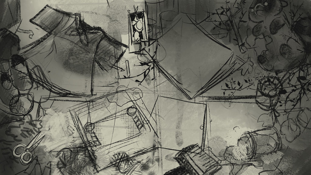
The initial sketch by me (Fable) was just a quick pass to etch out the idea and how it would flow. The intention is to show a messy floor, maybe with boxes of things everywhere. Maybe those are toys, maybe books? Don’t know. But I wanted some messy clothing, some suggestion of hair/fur snipping, paste and brochures, and finally some natural trash dragged in from outside. All split into compositionally pleasing quadrants that serve as their own internal illustrations. Nobody will see the backed up piece, but it’ll give the impression of a cohesive whole.
Tracy: I made a list of things I thought they would make use of in their childhood. Trying to relate it to one’s own childhood out in the backyard with all the piles of nonsense we’d have. And there’s allusions to some comics in there, aside from just the four that were featured, but I’ll leave other people to figure that out.
Note that the shuttlecock was drawn to look too modern. I should’ve done an oldschool version. They actually used real feathers originally, before they made them out of plastic and vinyl. But what I drew was what I had as a kid so *shrug*.
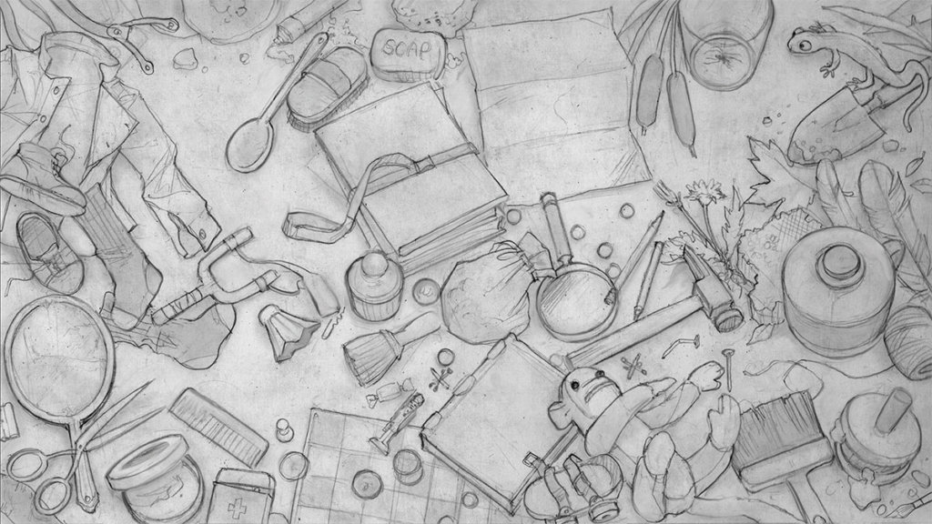
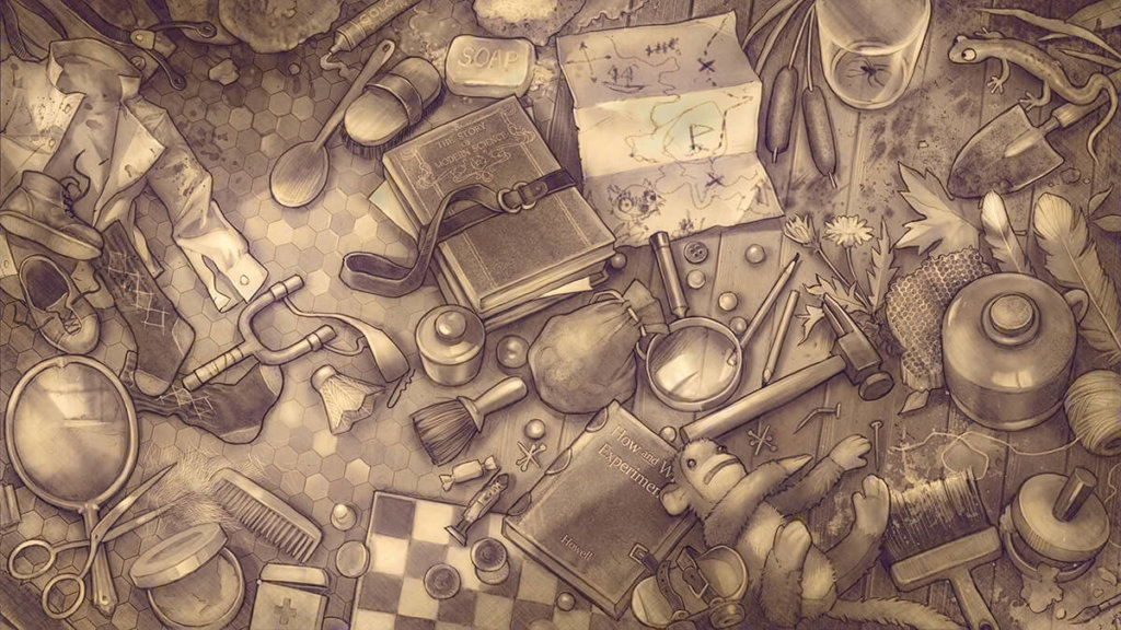
Fable: And so Tracy then took the sketch and expanded on itl More wazzits and woozits. Adjusting the composition a bit. Nailing down certain specifics. And as a result, the messy sketch is now a gorgeous illustration. Vastly improved over my original version.
Tossed back in my lap, I had to figure out how to illuminate it, let’s say.
I already knew the camera would be shifting from quadrant to quadrant in a counter-clockwise fashion, but exactly what would happen beyond “here’s the title” was up to me. Felt sensible to suggest light passing through a window off screen. Maybe dust floating in the air to give the shot a bit of subtle energy and depth. Also to give it that real nice nostalgic feel while also evoking the sunny spot a cat would nap in.
Lovely! Now I have something I can edit back into the dub easy peasy.
Of course it looks a little silly without the camera movement. But nobody was going to see it that way (until now that is)
And that’s how it’s done! Ah, but there’s an upcoming Lackachat video to announce, too! This Sunday we’ll be doing fun animations together with Gartic Phone.
Don’t miss it!
And last but not least, we wanted to give our fans some time to shine. We haven’t had a fan art feature since February (and here’s the first edition), so we figured we’re overdue to feature the community’s amazing artistic talent.
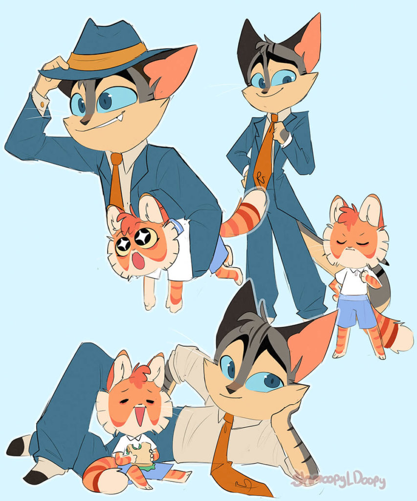
Credit: ShmoopyDoopy 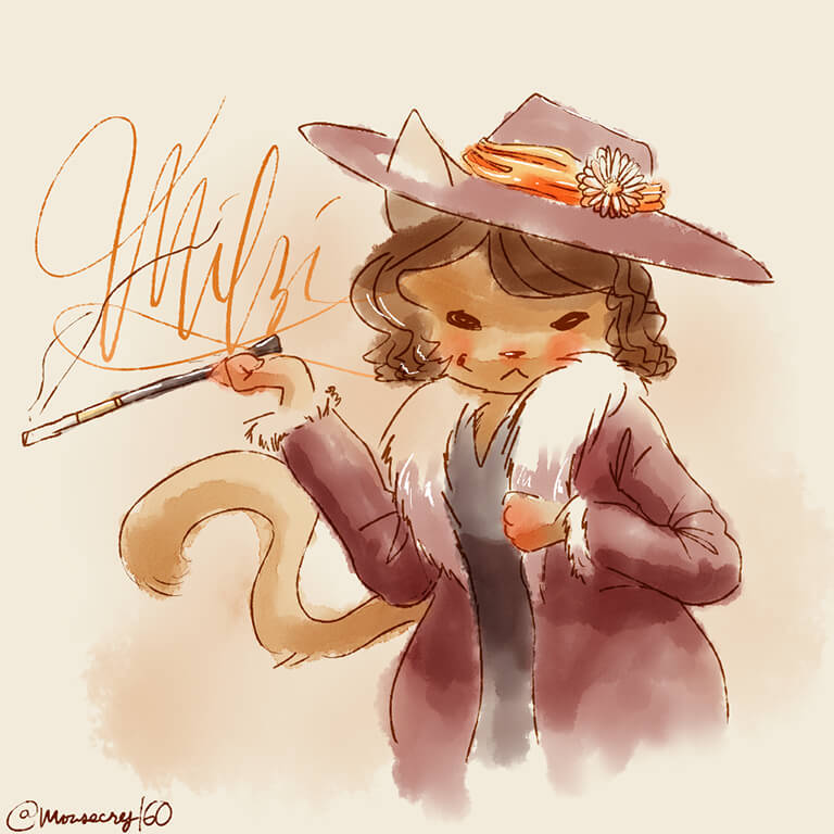
Credit: Mousecry160 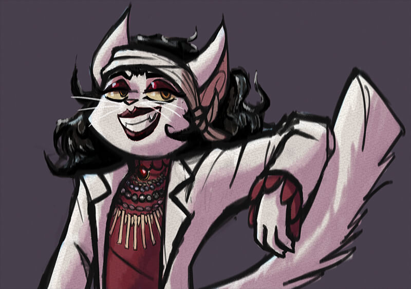
Credit: spookylinguini 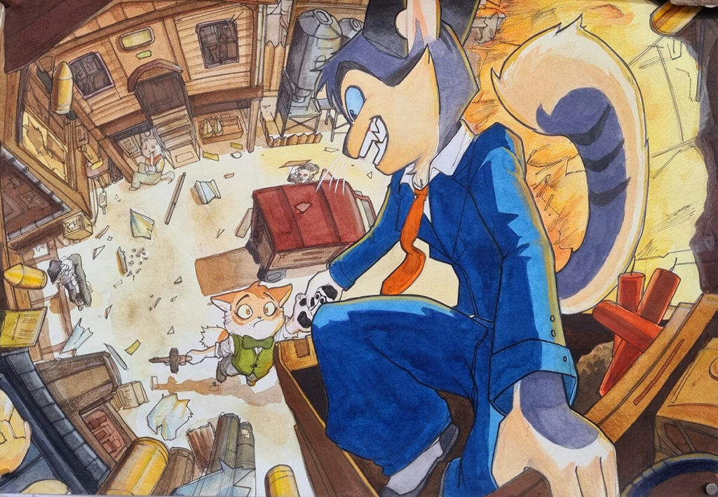
Credit: Kimroco 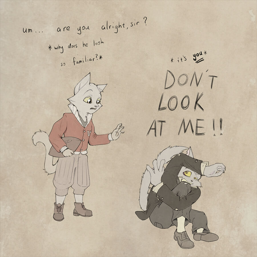
Credit: Malen Badger (colored by DiabeticcRacc) 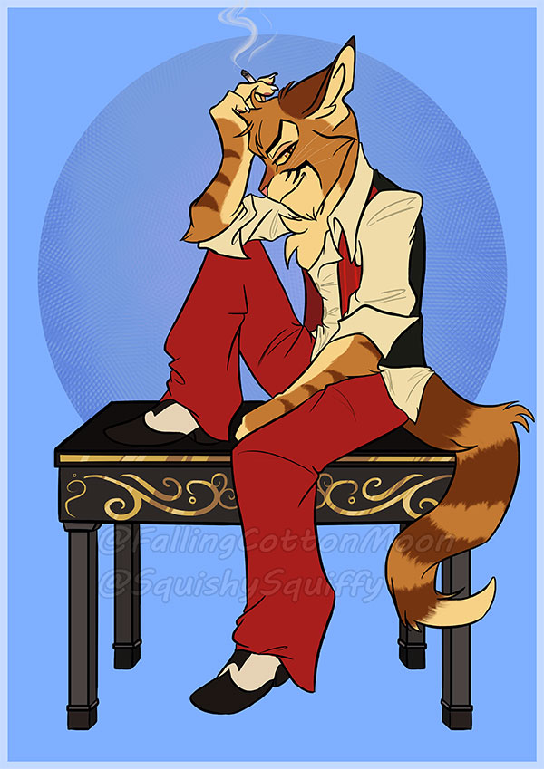
Credit: CottonMoon
And here’s an animation of Freckle being all wiggly (Dr. Katz style) by stinkyshowtimekinnie
And that’s all she wrote! Don’t forget to catch us on Sunday. Subscribe to our Youtube to get alerts!
Abyssinia! :3
